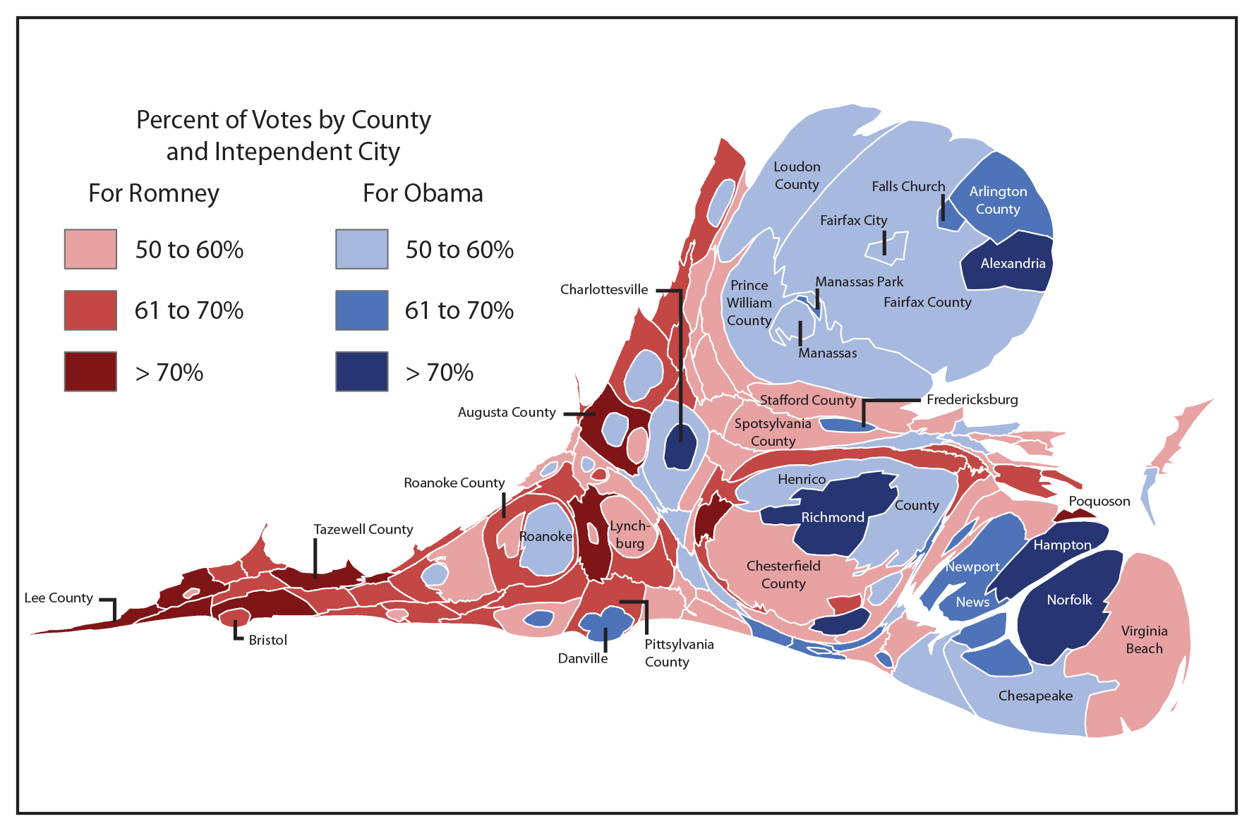
Conventional U.S. political maps, with their all-red and all-blue states and districts, don’t offer an accurate picture of fast-changing electoral trends, according to the current issue of the Virginia News Letter, published by the University of Virginia’s Weldon Cooper Center for Public Service.
New and innovative map-making forms can shed light on major trends such as how suburban areas have become the main battleground between Republicans and Democrats, both nationally and in Virginia, according to the article, written by two state political experts.
Conventional electoral maps used by news media show states and counties by their geographic size, not their population, and thus give a misleading account of voting patterns, say the authors, Stephen P. Hanna and Stephen Farnsworth of Mary Washington University. An innovative map called a cartogram, which sizes regions according to population, may appear startling at first, but gives a more accurate political picture, they write.
In the article, “Visualizing Virginia’s Changing Electorate,” the authors present a variety of display methods, including cartograms, trend mapping, precinct maps and maps at multiple scales to visualize changes in the Virginia electorate between 2000 and 2012. The conventional, geography-based maps showing districts won by Republicans or Democrats don’t begin to capture the real political landscape, especially in the fast-evolving suburbs, they write.
Rapidly suburbanizing counties in Virginia and elsewhere are the new political battlegrounds, Hanna and Farnsworth write. Precinct-level maps in these counties reveal the real geography of voting preferences and make it easier to match demographic and socioeconomic characteristics with electoral results.
“In Virginia, as elsewhere, suburban areas are neither monolithic nor static,” the authors write. “Over time their population densities have increased and their residents have became more diverse in terms of race, income and age. As a result, Virginia Republicans now risk being swamped in statewide elections by the latest wave of suburban migration.”
Compared to earlier waves of suburban settlement, the newer arrivals tend to be younger, more culturally diverse, and less conservative on social issues, Hanna and Farnsworth say. “Many cannot afford – or at least tend not to want to live in – large single-family houses. Instead they favor townhouses closer to major highways and mass transit. These new residents in the suburbs more distant from the urban centers, in short, are the sorts of voters who turned once-Republican counties like Henrico, Albemarle and Fairfax away from the GOP in recent presidential election cycles.”
At the national level, political analysts increasingly note the deepening divide between rural and white voters (the Republican Party’s base), on the one hand, and urban and non-white voters (the Democratic base) on the other. This divide makes the ever-shifting suburbs the main battleground between the two parties, the authors write. And the rapid changes demand different forms to visualize them.
On a cartogram, for example, the area of each state is scaled by its population, rather than its physical area. Massachusetts, with over 6 million people, is more than 10 times the size on a cartogram than Wyoming, with fewer than 600,000 residents. The more populous blue states of New York, California and New Jersey visually balance the now smaller plains and mountain states, accurately showing a much closer electoral outcome.
Conventional maps of “red versus blue” also hide the millions who voted for the candidate who lost in each state, Hanna and Farnsworth point out.
“A more creative approach to electoral map-making may be unsettling, but this challenges readers and viewers to rethink their assumptions about voting patterns.”
— By Robert Brickhouse
Media Contact
Article Information
May 3, 2013
/content/right-maps-you-can-see-how-electorate-changing-study-shows

